GoodRx Iron Cross DM
Client: GoodRx
Role: Art Director, Designer
Agency: R/GA
Scope: Direct Mail
Year: 2023
In 2023, we designed a direct mail package for GoodRx that required organizing a significant amount of required client content without overwhelming the reader. The challenge was presenting dense information across app features, pricing comparisons, testimonials, and partner inserts in a way that felt approachable rather than cluttered, all within a tight budget. The solution was to structure the content across a folded self-mailer with inserts, creating something compelling enough to open and digestible enough to drive action.

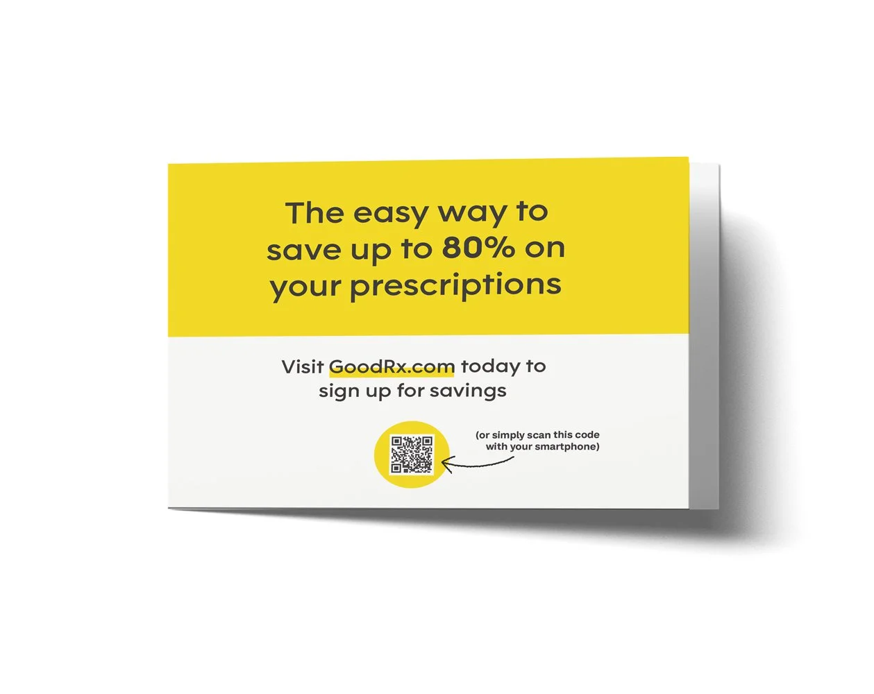
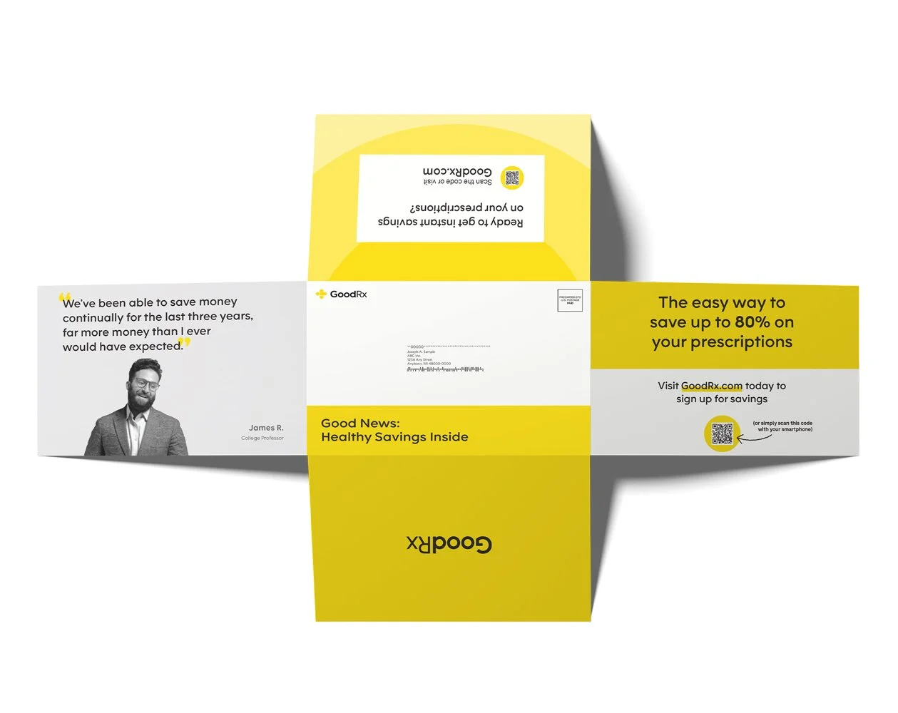
The carrier panel leads with a bold, benefit-driven headline set against GoodRx's signature yellow, immediately communicating the core value proposition before the piece is even opened. A clear call to action and QR code below give recipients an immediate path to act, making the most of the limited real estate available on the exterior of the mailer.
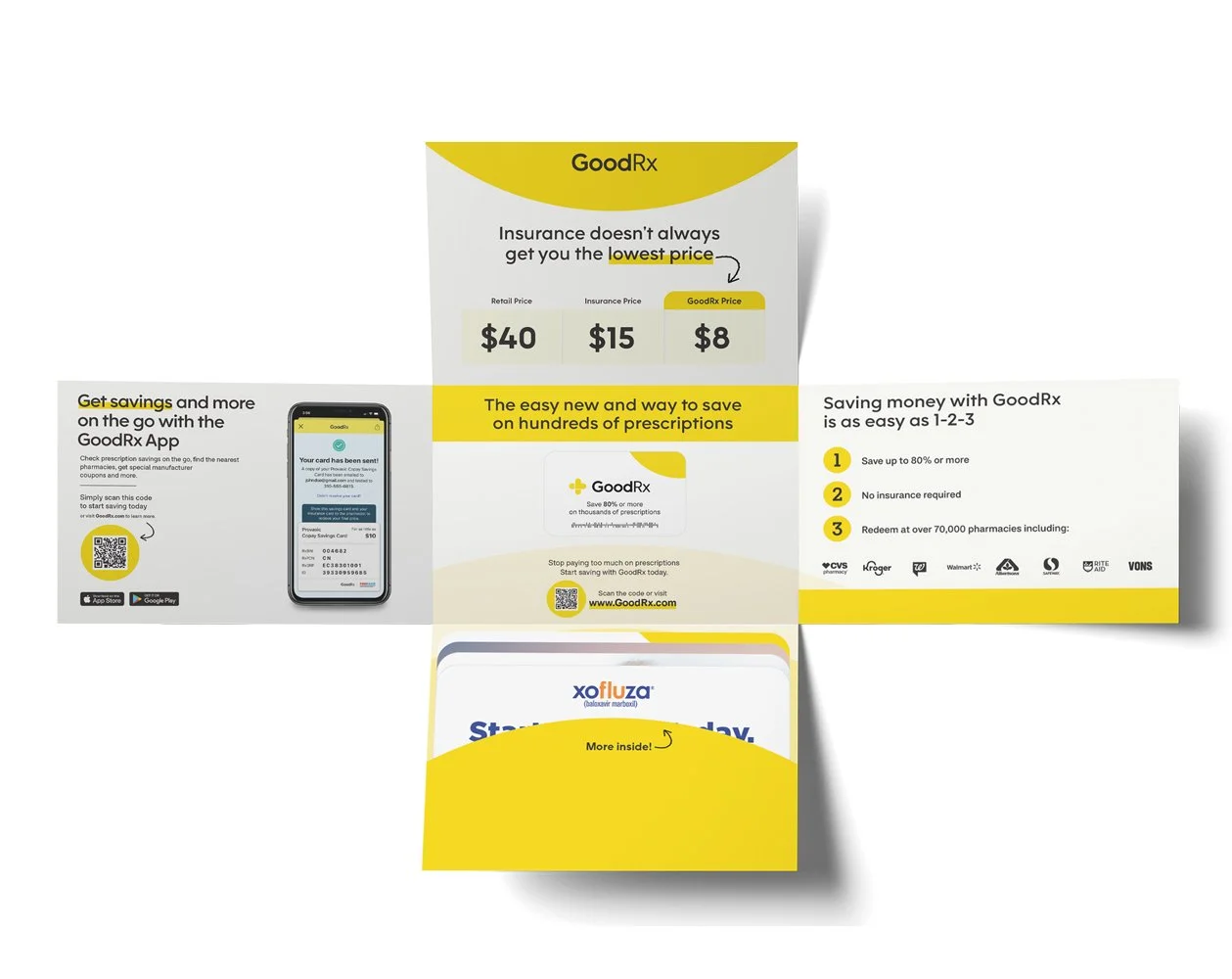
This view shows the mailer as it begins to unfold, revealing more of the interior panels. The app promotion panel on the left and the easy 1-2-3 savings breakdown on the right work together to quickly communicate how GoodRx works and where it can be used, giving readers everything they need to understand the value of the service before they've even fully opened the piece.
The fully unfolded back side reveals how every panel of the mailer was designed with purpose. The addressing panel sits at the center with the mailing information, flanked by the testimonial panel on the left and the carrier panel on the right. The top and bottom flaps, which are hidden when the piece is sealed, carry additional messaging, as well as the brandmark, that rewards curious readers who unfold the piece completely, squeezing every inch of available space to deliver value without adding cost.
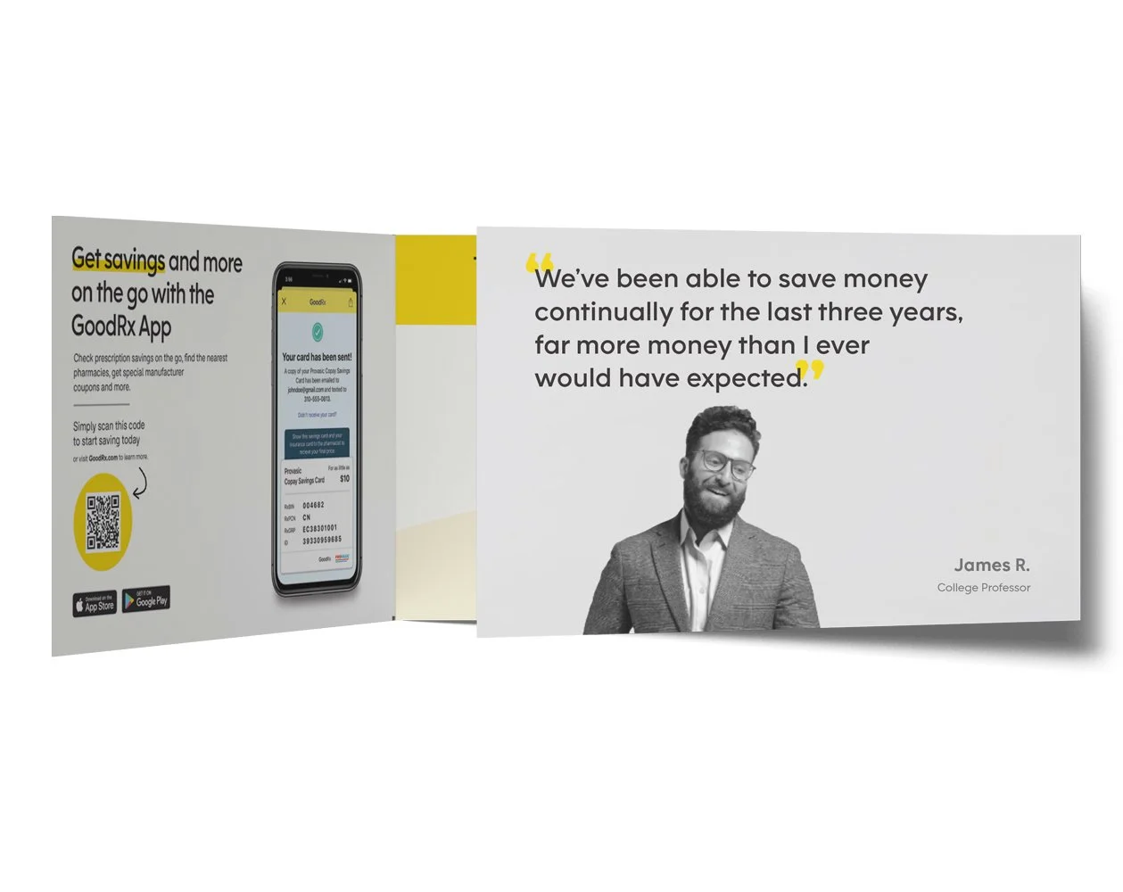
Opening the mailer reveals two distinct interior panels working together to build trust and drive app adoption. The left panel promotes the GoodRx app with a phone mockup and QR code, while the right panel lets a real customer testimonial do the heavy lifting, using generous typography and a portrait photo to add a human, credible voice to the message.
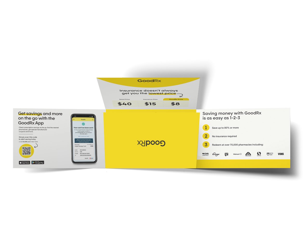
This view reveals the fully unfolded mailer alongside its pop-out insert cards, including a price comparison that makes an immediate case for GoodRx over insurance. A numbered breakdown and row of recognizable pharmacy logos reinforce the message, while the removable cards give readers something tangible to take to the pharmacy, elevating the piece from standard mailer to something genuinely useful.
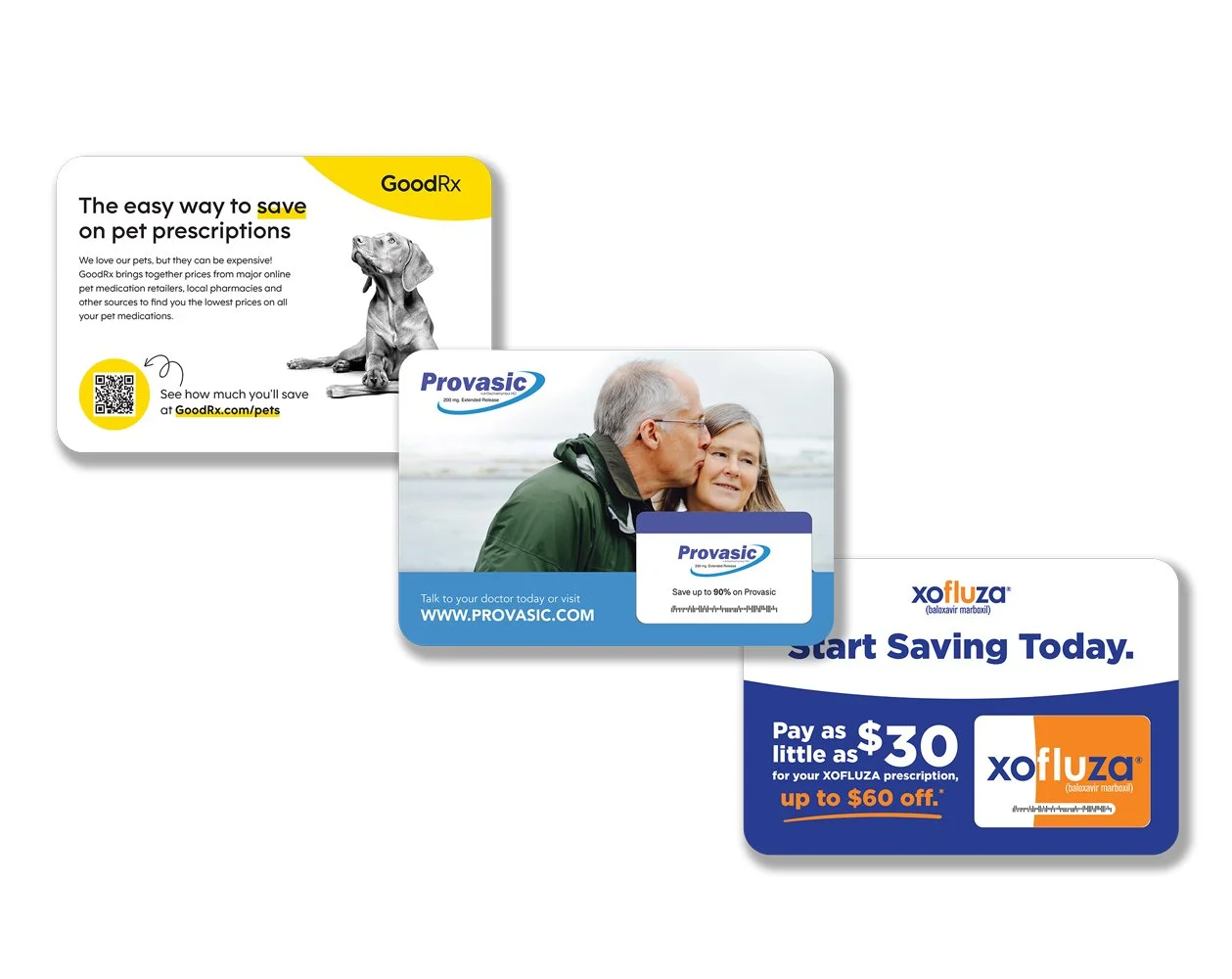
The three inserts tucked inside the mailer each serve a distinct purpose. The GoodRx pet prescriptions card extends the brand's savings message to a new audience, the Provasic insert promotes a specific prescription with a clear savings offer, and the Xofluza savings card gives recipients an immediate, tangible discount to use at the pharmacy for another medication. Together they add value for the reader while helping offset the overall production cost of the package.